Showing posts with label 5th grade. Show all posts
Showing posts with label 5th grade. Show all posts
Saturday, June 11, 2011
Metal Tooling Mythological Creatures
Monday, May 23, 2011
Tunnel Books
Tunnel Book- Pages of a tunnel book have cutouts, that allow the reader to look through the holes to the subsequent pages all the way to the back of the book. It is bound with two concertina spines placed on opposite sides of the book. Pages are attached to both concertinas. (Google Dictionary)
Arts Night
I work at two elementary schools and this month they each had their Arts Night. It is a lot of work but the results are really worth it. This year It was artist's choice but in the future I would like to choose one project per class. I think part of the key to a successful show is large noticeable labels (class, student name).
Labels:
0 Kindergarten,
1st grade,
2nd grade,
3rd grade,
4th grade,
5th grade,
Arts Night
Value Shelves
Prior to this lesson we did some value exercises. We folded our paper into four squares. We traced a smaller square of card board in the corner of each square and connected them with diagonal lines. We mixed different shades of gray by adding little dabs of black to small cups of white paint. We started with a light gray on the bottom of the shelf then added more black to mix a medium gray for the side and mixed a darker gray for the back of the shelf. While the shelves were drying students drew and colored objects to cut and glue onto them. Students were asked to think about the size or proportion of the object to the shelf.
Sunday, March 6, 2011
Op Art Opposities


This lesson follows up a lesson about Op Art. We spent some time looking at and discussing Op Art and optical illusions. Students created two drawings of opposite images. When the drawings were colored they measured 1" vertical strips across both drawings. Students cut one strip from one drawing and glued it onto a new sheet of 9x12 paper. They then cut the first strip from the second drawing and glued it next to the strip from the first drawing. They continued cutting and gluing one strip at a time from each drawing. Once all the strips were glued down they folded their paper accordian style. When opened up each opposite can be viewed from a different angle. The next time I do this project I think I would try using images that show movement so that when you look at the drawings it appears that they are moving.
Sunday, January 16, 2011
Winter Landscapes
,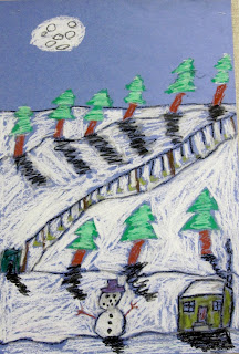
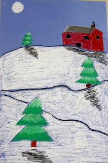
5th graders used oil pastels to create winter themed landscapes. We reviewed lots of vocabulary- landscape, horizon line, foreground, middleground, background... Students could include whatever winter elements they chose in their landscapes but each object had to have a shadow (colored in the same direction and away from the light source) and they had to make sure that they paid attention to atmospheric perspective- objects in the distance are smaller than objects that are closer. These came out great but we blew through white oil pastels!


5th graders used oil pastels to create winter themed landscapes. We reviewed lots of vocabulary- landscape, horizon line, foreground, middleground, background... Students could include whatever winter elements they chose in their landscapes but each object had to have a shadow (colored in the same direction and away from the light source) and they had to make sure that they paid attention to atmospheric perspective- objects in the distance are smaller than objects that are closer. These came out great but we blew through white oil pastels!
Labels:
5th grade,
drawing,
landscape,
oil pastel,
Seasons: winter
Wednesday, January 12, 2011
Roy Lichtenstein Inspired Self-portraits

We began by looking at Roy Lichtenstein's comic paintings. We discussed his techniques such as using primary colors and ben-day dots. After reviewing facial proportions and how to draw features students drew a self portrait. They included a speech or a thought bubble with a work or phrase that was important to them. Drawings were painted with primary colors and one area had to be filled in with ben-day dots. The results were very graphically strong.
Labels:
5th grade,
Artist: Lichtenstein,
painting,
Pop Art,
primary colors,
self-portrait
Sunday, December 19, 2010
Value Drawings


5th grade students were given a selection of black and white animal photos to choose from. they folded the image in half and taped it onto a piece of drawing paper. Students then had to duplicate the image paying close attention to different values. Before starting this project we spent a class discussing value and practicing on a worksheet.
Op Art

5th graders learned about Op Art. We looked at different examples and discussed what we saw in paintings by artists such as Bridget Riley and Victor Vasarely. Students used the width of a ruler to draw vertical lines across a paper. They then traced various sized circles, making sure that some overlapped each other and some were cropped off the paper. Students choose two colors (next time I do this lesson I will ask them to choose complimentary colors) to color with. They had to alternate coloring between the background space and the inner circle. I had them mark it off in pencil first so that I could check it before they started to color- it can get confusing.
Positive and Negative Space Designs


5th graders learned about positive and negative space through these black and white collages. They began with a 5x5 square which they drew symmetrical designs on. They cut them out and glued the pieces next to where they had been removed from.
Sign Language Names


5th graders created sign language name designs. We began by discussing what a font was and viewing different fonts. They used oil pastels to write their name in different fonts and sizes all over a 18x18 piece of colored paper. They then traced their hands for however many letters were in their name and cut them out. Using a copy of a sign language alphabet students shaped their cut out hands into the signed letters of their name and glued them onto the background paper. They used sharpie to add details such as finger nails and knuckles.
Thursday, July 29, 2010
Sunday, June 6, 2010
Winter Birch Trees
Students begin by painting the background using wet on wet watercolor techniques to create a sky and snowy ground. Once the background is dry, students used markers to add details such as fences, animaks, footprints, etc. They then cut and glued white strips of paper which they used sharpie to draw small black lines. They then added shadows by using a very light grey paint on the dies of the tress, under the trees and any other details they added. We talked about where the light source comes from and how all of the shadows should be on the same side.


Chinese Scrolls
We looked at reproductions of Chinese scroll paintings and discussed their consistent theme of nature. We noticed that there were often mountains, trees, bodies of water and clouds depicted in these paintings. Students drew a landscape using these elements. They added detail with oil pastel before painting with tempra cakes.


Starry Night
Sunday, May 9, 2010
Robert Indiana Inspired Word Drawing
We looked at Robert Indiana's Love painting. We discussed font and how the way a word is written can demonstrate its meaning. Students folded a square piece of paper into 4 boxes and chose an appropriate four letter word- one letter in each box. Student's had a variety of fonts to look at for inspiration to design their words.
Saturday, May 8, 2010
Picasso Inspired Portraits
Students look at and discuss Picasso's abstract portraits where multiple views are shown simultaneously. Demonstrate a frontal portrait and profile view. Incorporate Picasso's use of color and line.
Subscribe to:
Posts (Atom)


